It’s all about the experience! Imagine watching your favorite movie in an IMAX 3D cinema hall or on Netflix at home. What’s the difference?- “Experience” Similarly, modern-day business interactions by users are experience-centric. An enhanced user experience (UX) for your websites is necessary for a competitive market.
Well-conceived and designed UX can help businesses improve their conversion rates by 400%. So, creating an enhanced user experience is not just beneficial to your website traffic but also to sales goals. Getting it right is not just about excellent visual appeal; you need a functional interface.
Importance Of Ux In Web Design
Web design takes center stage when it comes to user experience. This is why 94% of first impressions are design-related. However, web design’s impact is not limited to first impressions. It can affect customer loyalty, conversion rates, and more.
Similarly, a good web design can mean better sales. According to a survey, 88% of customers don’t return to a website with a bad user experience. So, achieving sales goals can be challenging if your web design does not offer good UX.
Top Tips To Elevate Ux For Your Website
#1. Know Your Target Audience And Start With User Research
Knowing your audience is key to achieving higher UX. Without a target audience, your efforts will not provide desired results.
How to conduct user research?
Start by defining your target audience through persona identification. Understand different aspects of your audience like,
- Demographics
- Cultural differences
- Ethnicity
- Spending power
- Position in an organization
Especially for B2B businesses knowing the specific persona of the audience is key for sales conversions. Based on these data, you can segregate potential customers and focus design efforts on improving their experience.
Some of the best research approaches to use are,
- Online surveys are a set of questionnaires that help understand the user’s requirements.
- Guerilla research is an in-person approach where fast validation of ideas occurs.
- Parallel design is an approach where several design teams create designs parallelly. Further, these are compared, and the best of them are picked for implementation.
Using these approaches, you will better understand the target audience. After defining the audience, it’s time to design an excellent UX. Start with the most crucial aspect-” page loading speeds.”
#2. Page Load Speed Optimization
Who doesn’t like speed? Your websites need to load faster for enhanced UX. According to Portent, 0-4 seconds loading speeds can improve conversion rates three times. However, for most business owners, there are two vital questions regarding loading speeds,
- What are the tools to measure speed?
- How to improve loading speed?
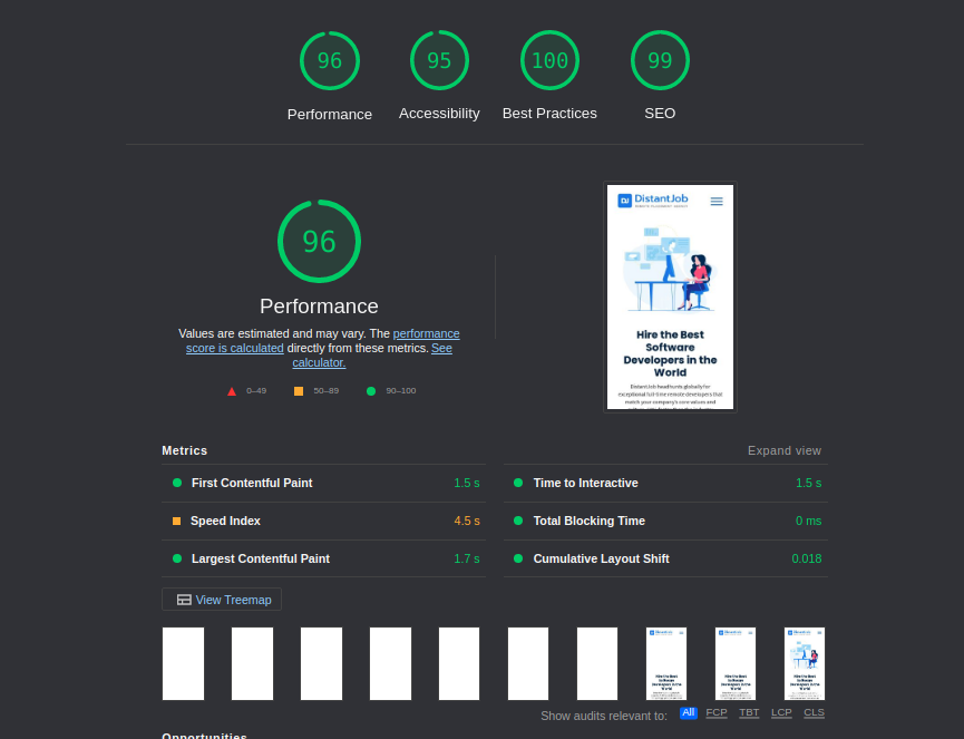
The answer to the first question is Web.dev. Based on Google’s Lighthouse provides comprehensive metrics to measure the web app’s performance. It also includes the speed of loading a website. These metrics are also the core web vitals, essential for SEO purposes. Google uses core web vitals as key indicators to assess the page experience of websites.
Some of the essential parameters that you can measure are,
- Largest Contentful Paint(LCP) helps measure the loading speed of the main content on your website. It should be less than 2.5 seconds for an excellent user experience.
- First Input Delay(FID) measures the delay between user input and presentation of that data on the screen. The delay should not be more than ten milliseconds.
- Cumulative Layout Shift(CLS) is a metric to measure the visual stability of the website. A layout shift is an event when there are unexpected changes in the view part of the website. We often see them as accidental clicks which occur due to the delay. It should not exceed 0.1 seconds.
- First Content Paint(FCP) helps measure the delay between a page’s loading and when the content gets displayed. A good FCP score should be less than or equal to 1.8 seconds. Anything above 1.8 seconds and below 3 seconds in FCP needs improvement.

As you can observe from the above image, the website has good FCP, CLS, and LCP. The only thing lacking is a higher speed index. It is a metric that allows you to measure how quickly the contents of a page populate the screen. The ideal time for the speed index is 0-3.4 seconds.

The solution for a higher speed index is to reduce the server response time, as suggested by the Web.dev results. This can be due to a bloated website full of themes, plugins, and other elements contributing to server response time.
Apart from the Web.dev, there are other tools that you can use for loading performance management, such as:
- Uptrends
- Sematext
- Google’s Web.Dev
- GTmetrix
- Uptime
- Dareboost
Once you have the page loading speeds optimized, it’s time to optimize the design spaces on the website.
#3. Use of Whitespace
Whitespaces are one of the most used design spaces to elevate UX. It is a negative design space that wraps around content or other elements.

If you check the homepage of the New York Times, you can see whitespaces around its name, elevating the visual aspect. Similarly, you can use white spaces to elevate content, landing page titles, CTAs, etc.
You can divide whitespaces into two main categories for optimized web design,
- Micro whitespaces are smaller gaps and buffers between content elements.
- Macro whitespaces are massive gaps wrapped around other elements like landing page hero text, CTA buttons, etc.
Using whitespaces can elevate different elements as per requirement. For example, you can upgrade CTAs for higher conversions with whitespaces. Using negative spaces is an excellent approach. However, some elements in web design help with more than just engagement.
#4. Implement Social Share Buttons And CTAs
Social sharing buttons are design elements that allow users to share your content across social media platforms. This will enable you to improve traffic. However, while you may achieve good traffic, converting them to potential customers, you need reliable CTAs.
CTA buttons are gateways through which customers discover more about your brand or product. It allows conversion of consideration into sales. So, the implementation of CTAs is key to better conversion.
Here are some ways to optimize CTA implementation for your website,
- Use CTAs that are unique to your product or service
- Add actionable content that leads to CTAs
- Avoid using too many CTAs just to fill your page.
Another factor impacting UX is the entire customer journey while navigating through the website.
#5. Proper Navigation To Guide Users Through Your Site
When a user interacts first time with your website, it becomes key to reduce the navigation steps to reach content or product. For example, if you are an eCommerce website, finding a product page within two to three clicks on the website can elevate the UX.
Here are some tips to improve the navigation of your website
- Create a sitemap for better navigation guidance for users
- Use menus that convey all the essential information
- Build advanced search capabilities for the website
- Include navigation cues in your menus and sub-menus
- Leverage dropdowns for better visibility of menu options
Using these tips, you can improve the UX of the website. However, one aspect of web design can negatively affect UX- “Advertisements.”
#6. Remove Distractions And Don’t Let Ads Overpower
Advertisements and popups can be a distraction to the UX. For example, a study was conducted by Pandora music on 385 million users. The results suggested that users in the high ad group who were served 38% more ads listened to the music for fewer hours. On the other hand, the low-add group with 25% ads listened to music for more hours.
Such results suggest that ads can be distracting and even a reason for traffic attrition. So, it’s paramount to balance the ad placement.
Minimize ads and popups to ensure that it does not hinder UX. Apart from reduced ads, being responsive to multi-screen resolutions is essential.
#7. Make It Mobile-Friendly (Responsive)
A responsive web design is crucial to your UX as it allows a uniform experience across screen orientations. In addition, responsive web design needs to optimize multiple elements in the underlying structure. For example, you need CSS breakpoints for responsive breakpoints that allow a website to adjust the view according to screen size.
Similarly, you can use the following tips to improve the mobile responsiveness of web design,
- Use fluid grid elements to readjust the view according to screen size
- Build visible and easy-to-access buttons for mobile screens
- Leverage responsive image and video tags to improve the experience across devices
- Optimize typography to fit the screen size.
- Perform responsive tests to determine the responsiveness of the website.
Lastly, making your website visually appealing can attract more visitors.
#8. Make It Visually Appealing-Colors, Heading, And More
Visually appealing websites have a better chance of repeated visitors. It’s not about eye-catching images and colors but more about consistency. So, the first thing that you need to keep in mind while designing the website is to ensure consistency of brand colors.
Apart from the colors, you also need to add images and videos of high quality to elevate the experience. Here you will have to strike a balance between quality imagery and keeping the size of pictures to a minimum. Images and videos need to be lightweight, or they can affect the loading speeds.
Conclusion
Designing a website requires more than installing plugins and making a trick or two. You need to ensure your website is aesthetically pleasing, fast, and overall provides a solid UX experience. For this, having tech experts is the best solution.
A UX developer can help you build highly responsive, interactive, and functional web design for higher UX. Contact us, and we can help you find the best remote UX developer in just two weeks.


